When talking about layouts in CSS, we often divide the different types of layouts into 4 categories:
- Static (also called a fixed layout)
- Liquid (also called a fluid layout)
- Adaptive
- Responsive
What are the differences between these? Let’s go through each one and see what the differences are.
If you want to follow along with this post, go to the (now archived) website liquidapsive.com, where you can try out all these layout types yourself.
Static Layout
In a static layout, the size of elements are set using fixed units, such as pixels.
Let’s say you had a website with a sidebar that was 300px wide and 500px tall. If you resized the browser window or opened the website on a phone, the size of the sidebar would not change at all. And if the browser viewport became so small that the sidebar didn’t fit, you would see scrollbars.
The problem with static page layouts is that they are not optimized for different screen sizes. If the website was made to look good on a desktop computer, it wouldn't look as good on a smartphone.
Liquid Layout
A liquid layout uses relative units such as percentages and ems.
If you change the width of your sidebar from 300px to 20%, and then resize your browser window, the sidebar would grow or shrink depending on the size of the browser window. The sidebar will always take up 20% of its parent element, and that could mean 200px, 600px or anything in between. The element is liquid, and changes its size every time the browser viewport itself changes its size.
A problem with liquid layouts is that some elements may become too narrow or too wide. This can cause the layout to break, and make the text harder to read.
Adaptive Layout
An adaptive layout uses fixed units such as pixels, just like a static layout.
What distinguishes an adaptive layout from a static layout is its use of media queries. By using media queries, an adaptive layout changes when the viewport is at certain widths.
In our sidebar example, you could set the width of your sidebar to 300px, and then use media queries to change its size when the viewport was smaller or larger. An adaptive layout is optimized for different screen sizes, but unlike liquid layouts which adapts all the time, an adaptive layout changes only at specific points.
A possible downside with this type of layout is that you have to design many different layouts for different viewports, and this can make your website more complex to maintain.
Responsive Layout
A responsive layout uses relative units such as percentages and ems, just like a liquid layout.
It takes the best from both liquid and adaptive layouts, using both relative units and media queries. This makes it possible to deliver the right layout for each device and viewport size.
If you want to give your users a great experience no matter what device they are using, using a responsive layout is the way to go.
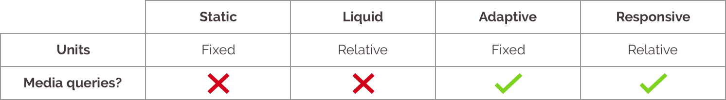
Here’s a recap of the main differences:
Personally, I always make my websites responsive, and I believe that this is the best way to build layouts for the web. An adaptive layout can also work, but avoid the fully static or liquid layout if you want your website to look good at different sizes.